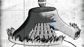
Role- Animator
Deration: 3week
This animation was done in 15FPS (frames per second) hand drawing each frame. I was inspired by the old Akira Kurosawa films and wanted to replicate them to the best of my ability.
I use Procreate animation feature as my designated software and composited everything in Premier Pro.
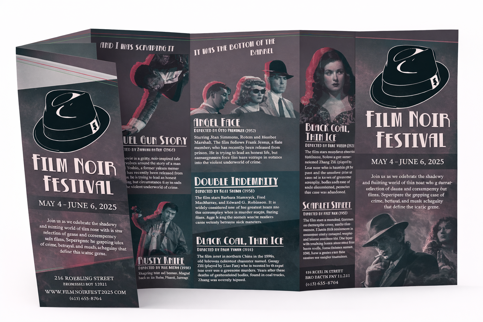
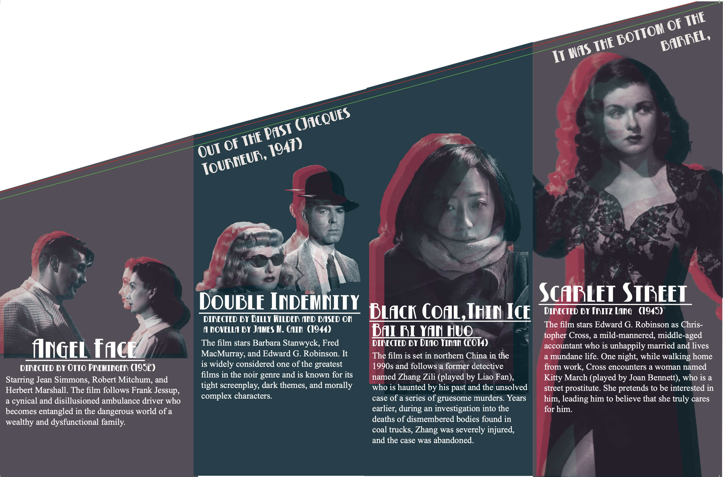
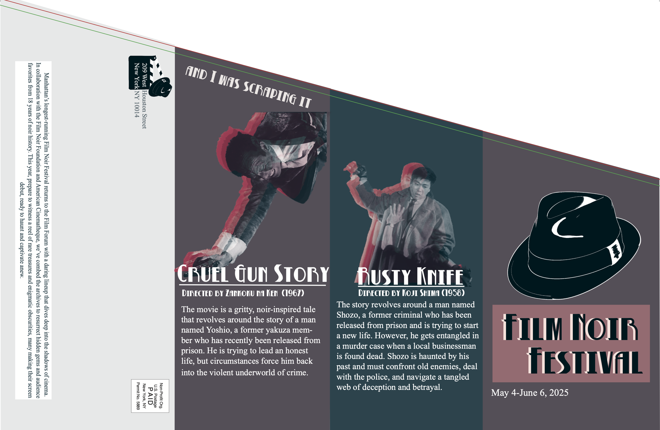
Role-Designer
Duration: 3week
The Film Noir Brochure was a pretty interesting one to say the least. Using only two colors to make this piece was challenging yet invigorating. I chose ghostly liked figures for the images to portray the actors because it reminded me of classic movies that are so memorable even though the actors are long gone. The typeface I decided to use was mainly of an older type of noir style.
Deration: 2week
Role-Designer
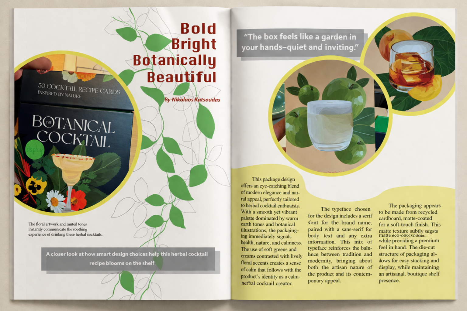
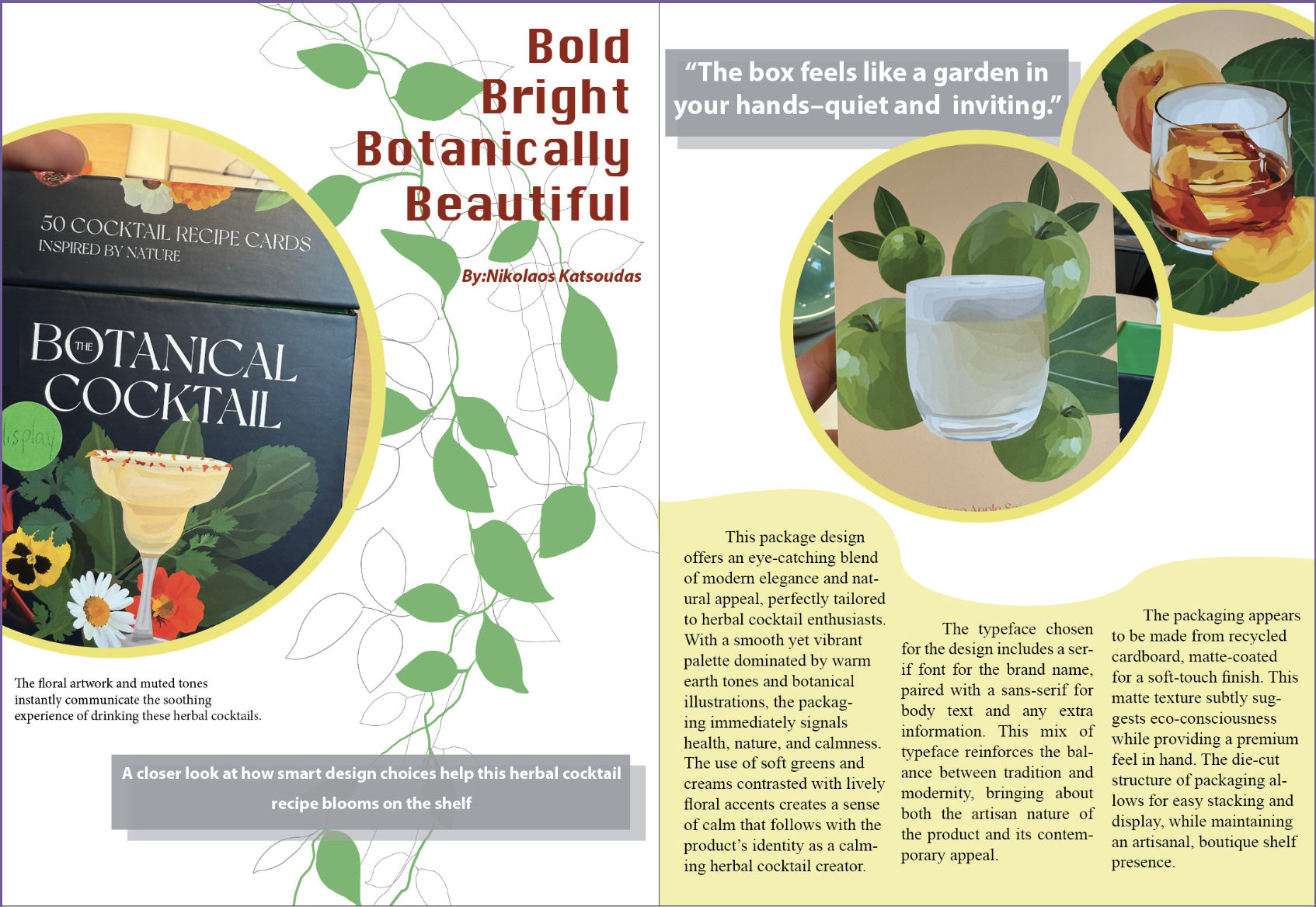
This MoMA article was following the same concept as the product. It is calm, minimalistic and botanical. I put the draping ivy in the background to increase the aesthetic appeal. The circles and the waviness conveyed meanings of nature and growth as well having a soothing effect.
When I was designing this I was keeping in mind the packaging and not wanting to replicate it but rather mimic the concept. I also wanted to follow a similar color pallet as the box I had to review.
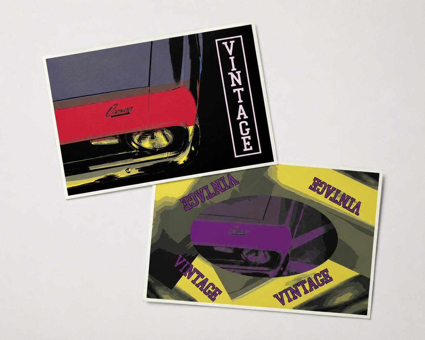
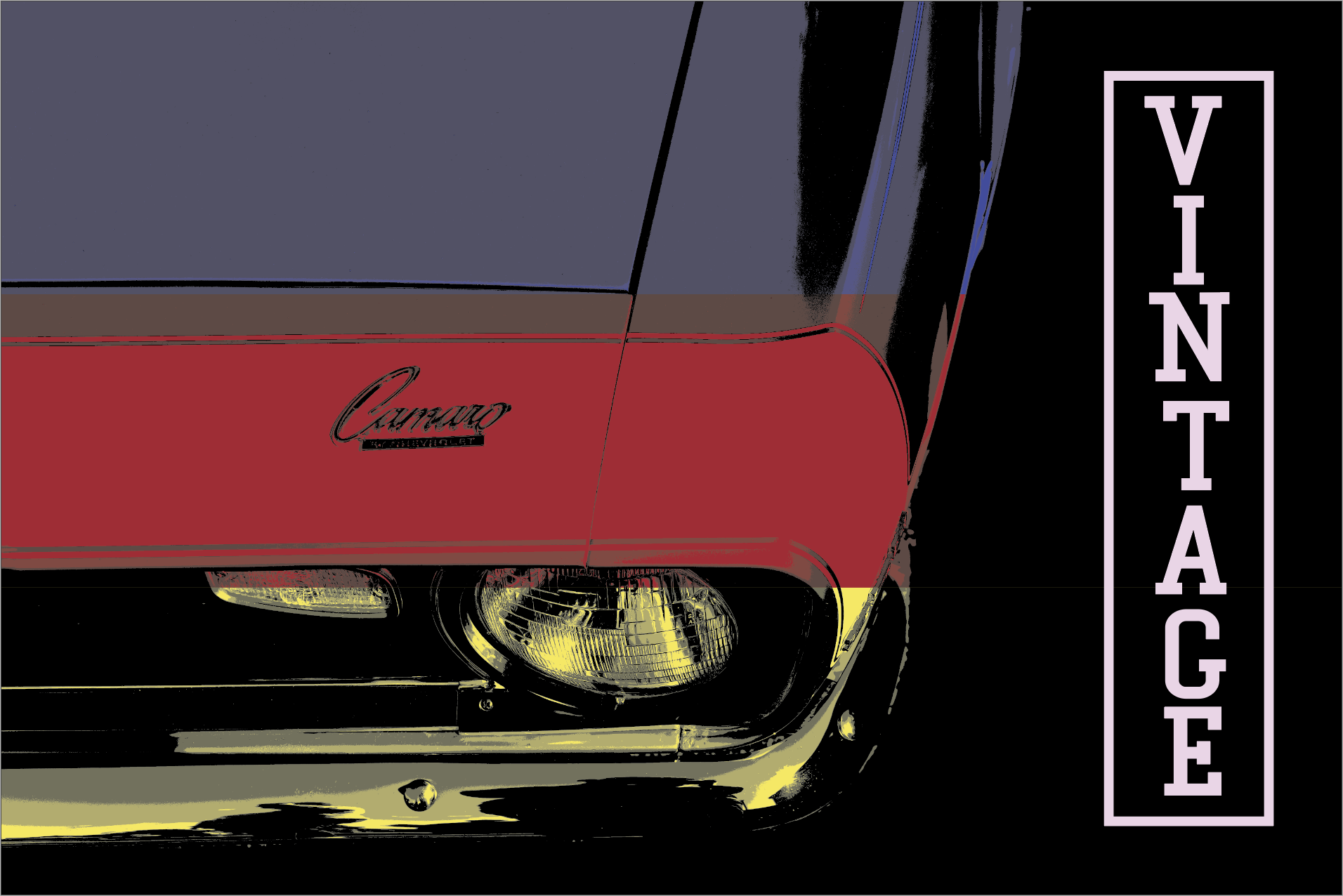
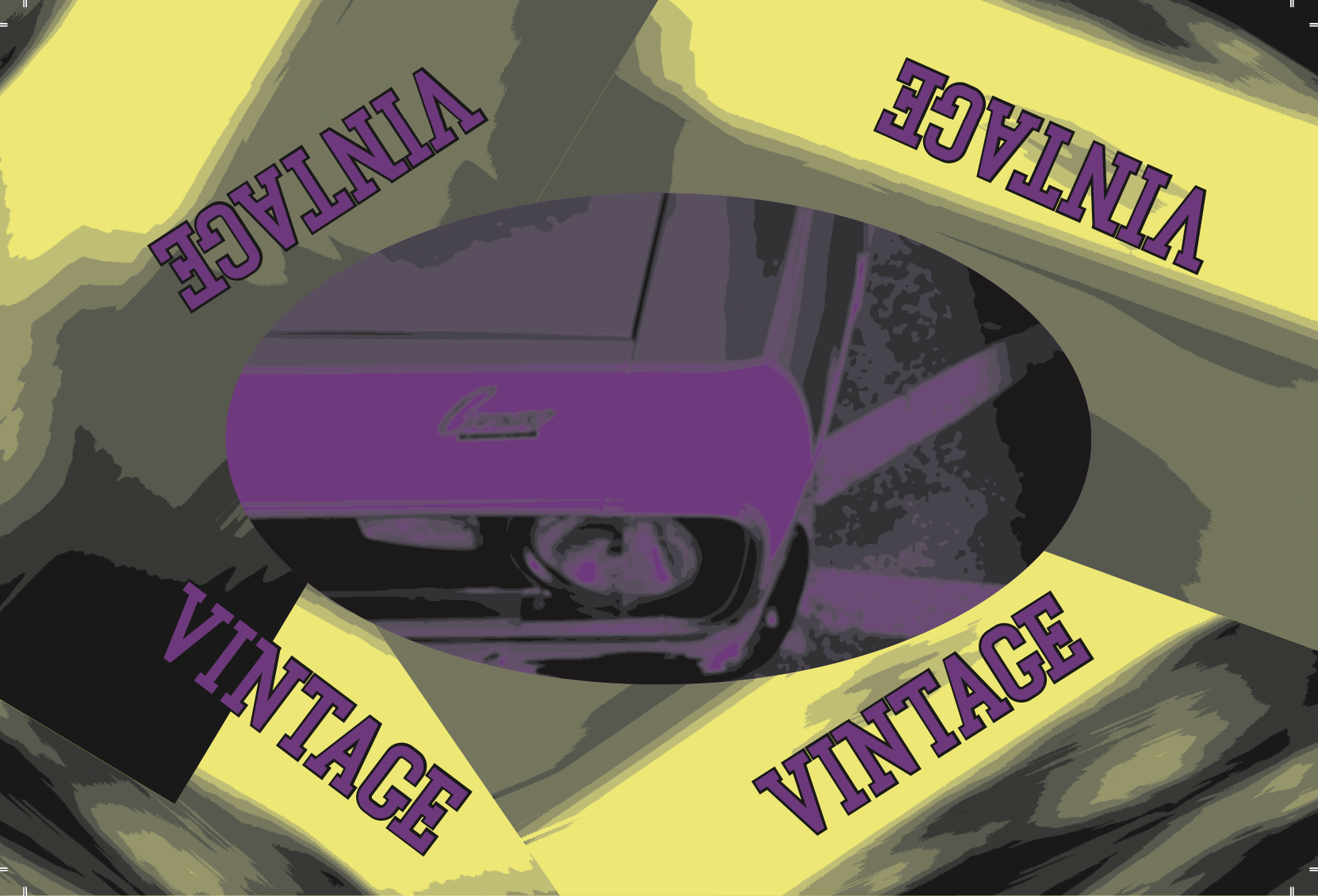
ROLE- Designer
Duration - 4weeks
In this project, the client was interested in a unique perspective of a classic car postcard. For the vehicle, I chose a 1969 Camaro focusing on the drivers side hood logo and headlights. Since this project was eccentric, I thought that particular vehicle angle matched, as did the use of developing a 2-tone and 4-tone postcard. The blurred line effect was used for smoother transitions between the use of only purple and yellow. The “Vintage” logo was added for nostalgia purposes.
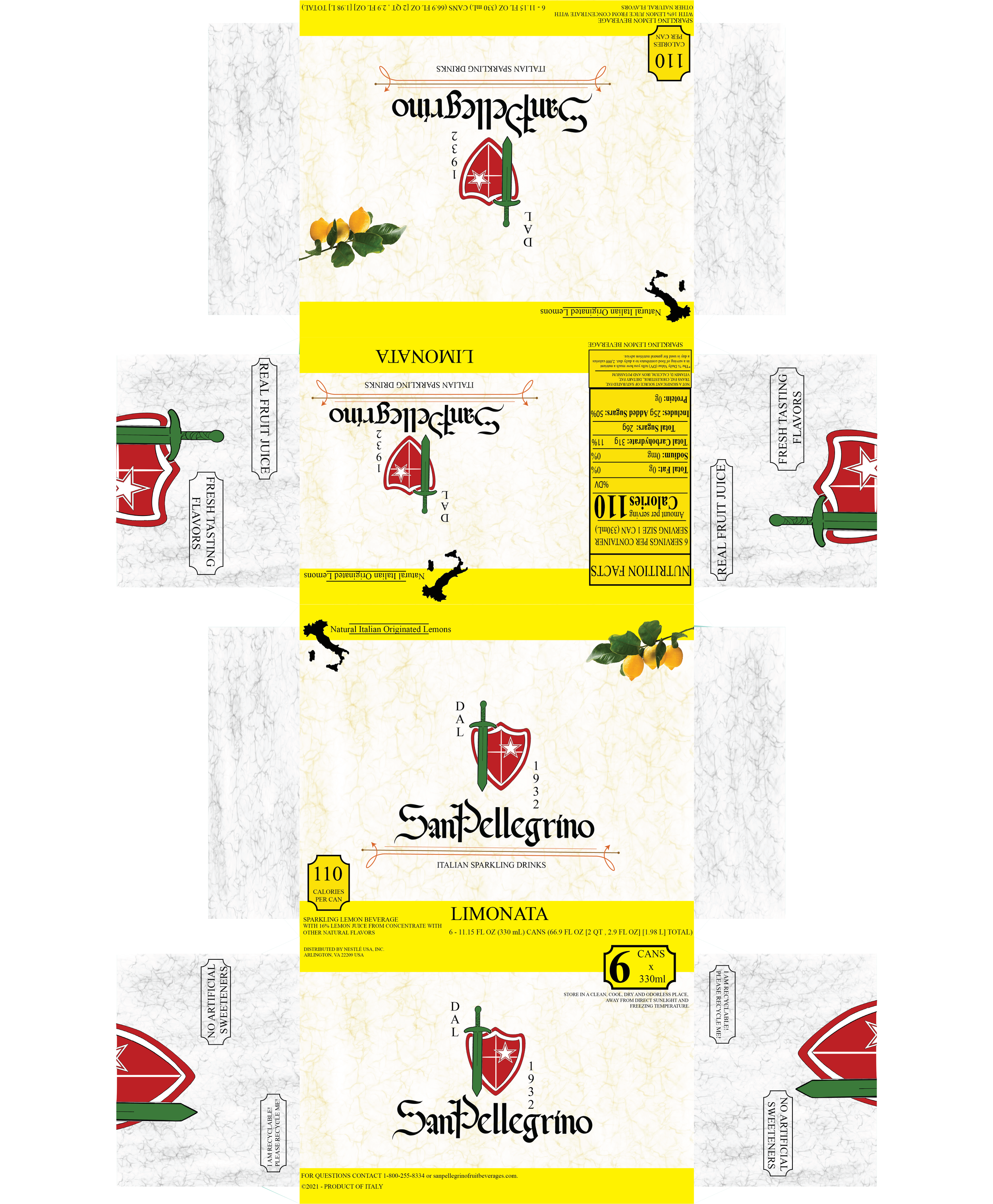
Duration- 3weeks
Role- Designer
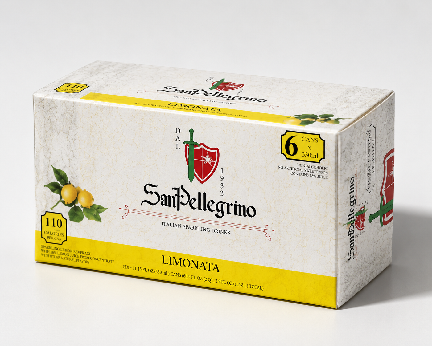
For this project, I was heavily inspired by Italian Classics. The typography used was of an ancient European style, mainly Italian, to give a more sophisticated feel to the brand. The new logo idea was inspired by the sword and shield of the knight templar, and was fitting. The logo color represents the Italian flag.
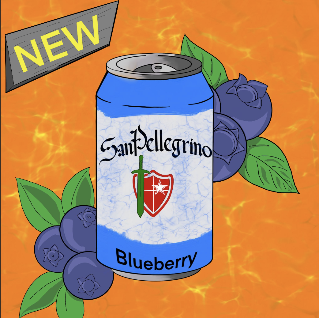
I incorporated the preexisting SanPellagrino star on my new logo re-design as well. The marble box depiction was influence by Italian stone and granite statues and architecture. I also put the logo on the flaps so it would stand out along with the name as the boxes are stacked in store displays. The can revamp is the same for all, with the exemption of the paint brush stroke representing the flavor.
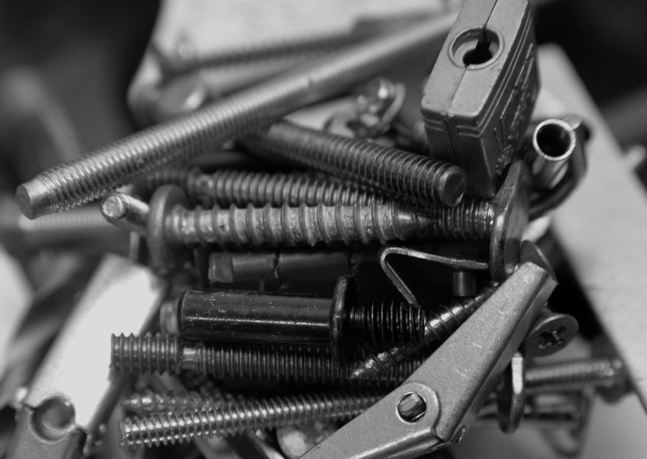
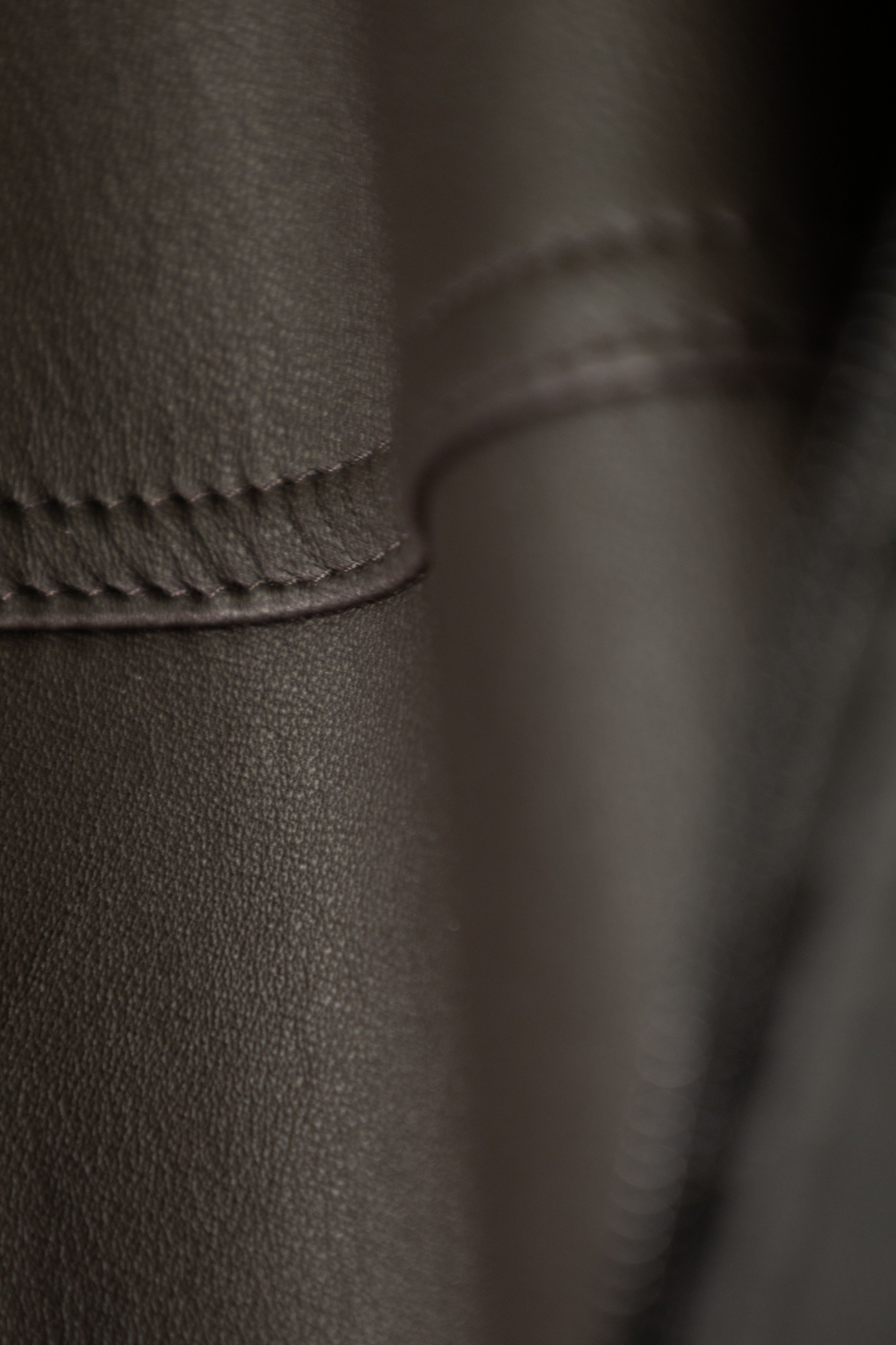
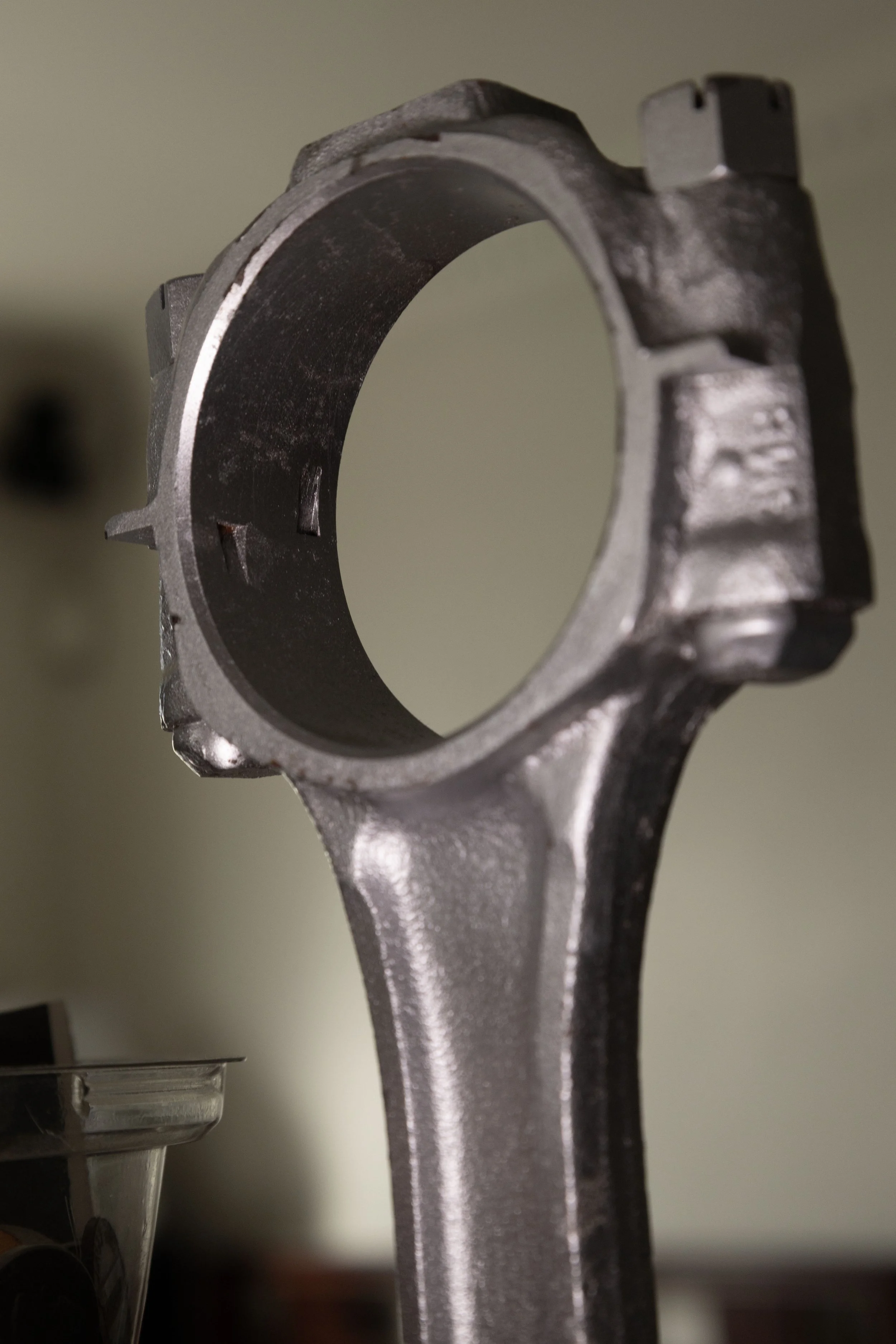
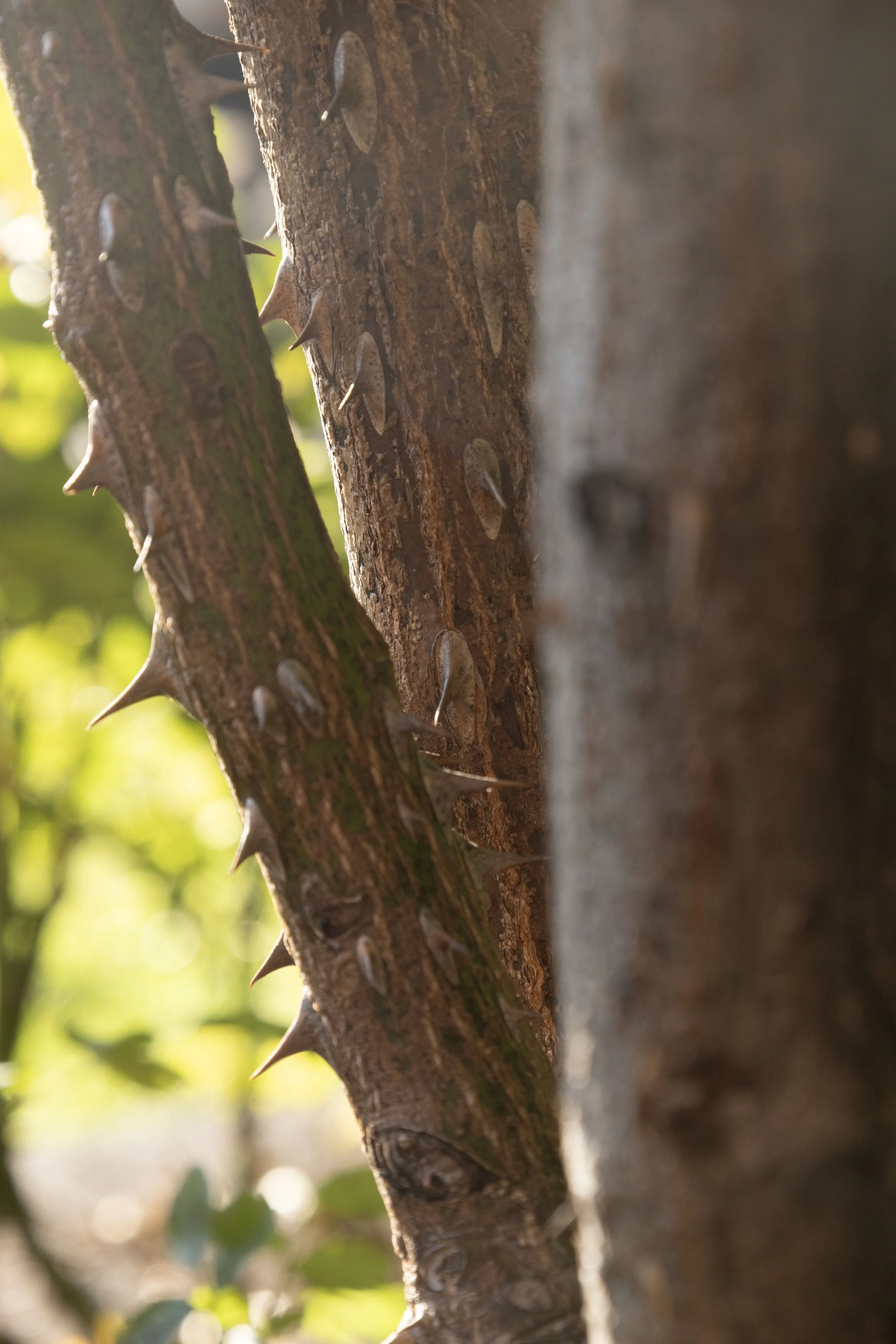
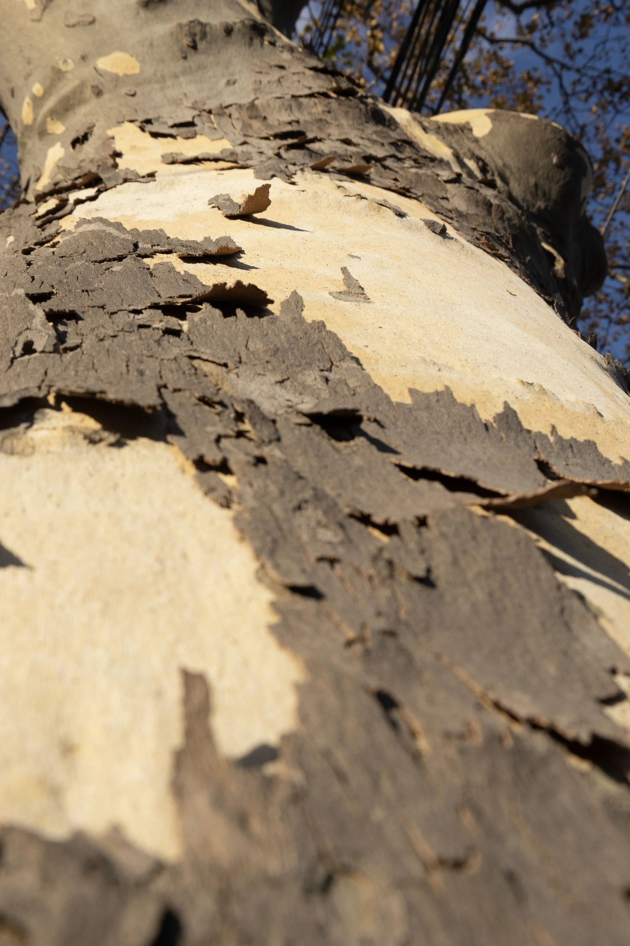
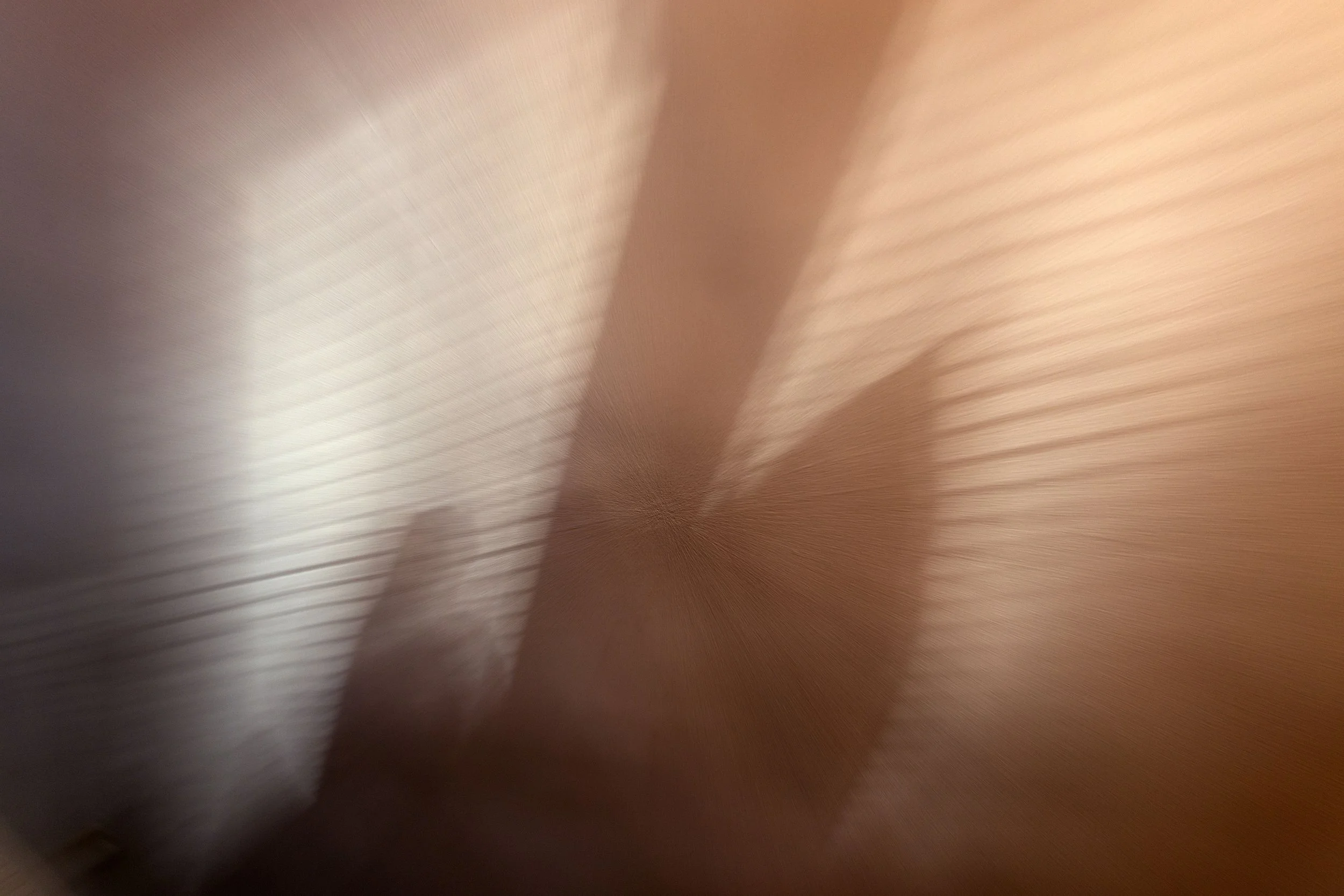
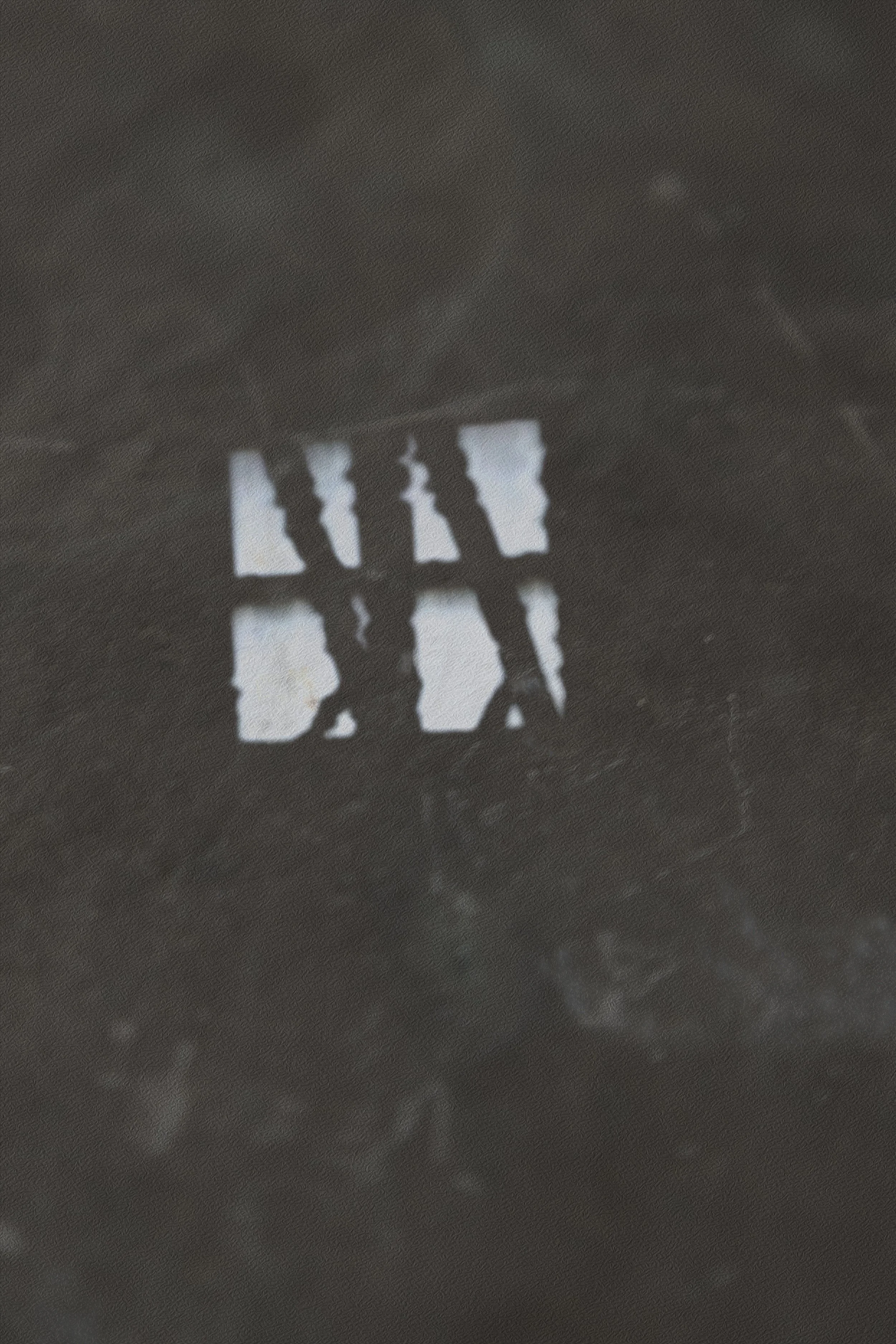
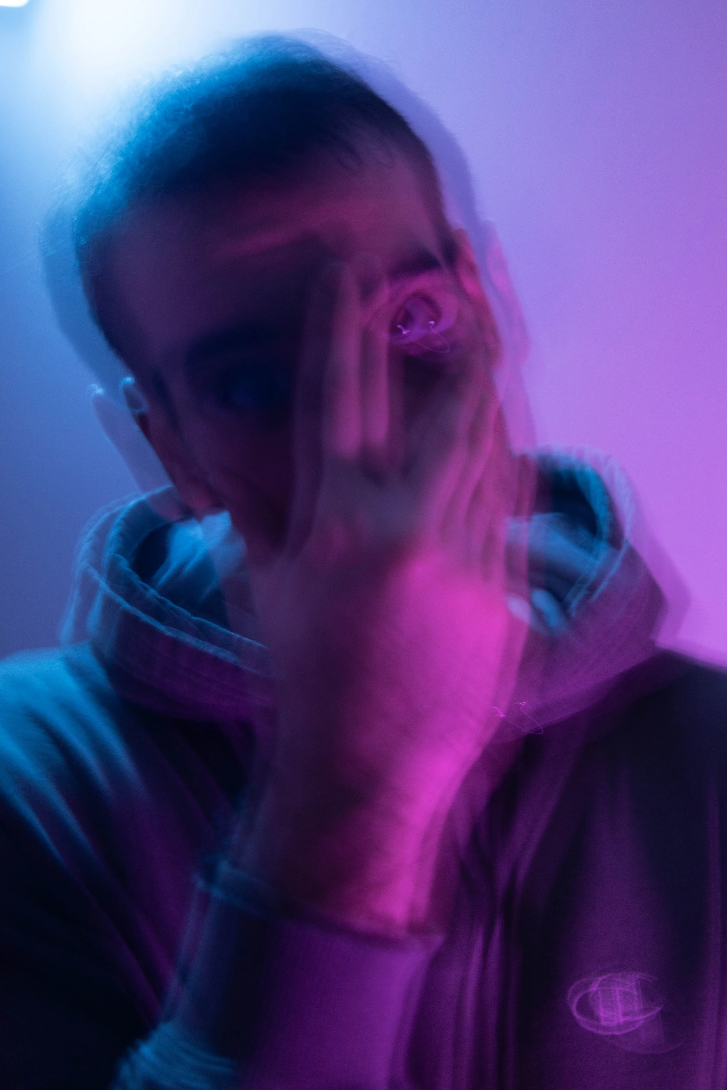
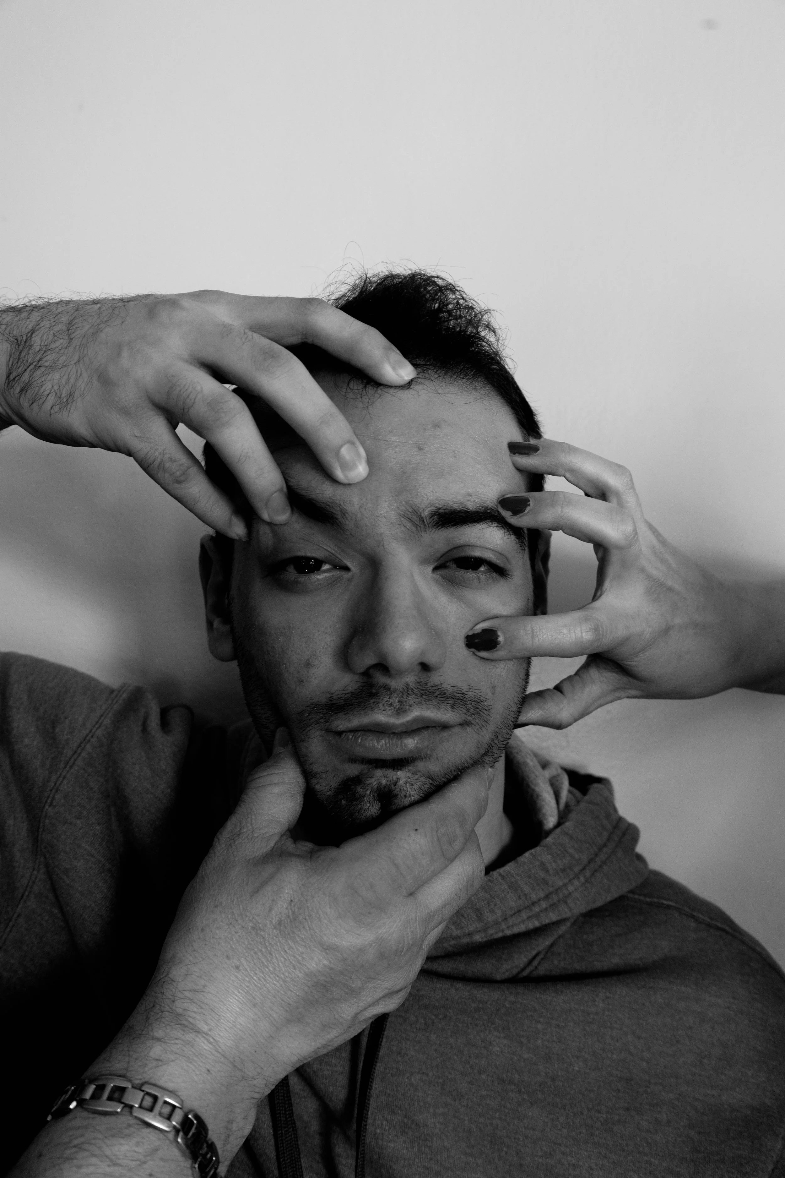
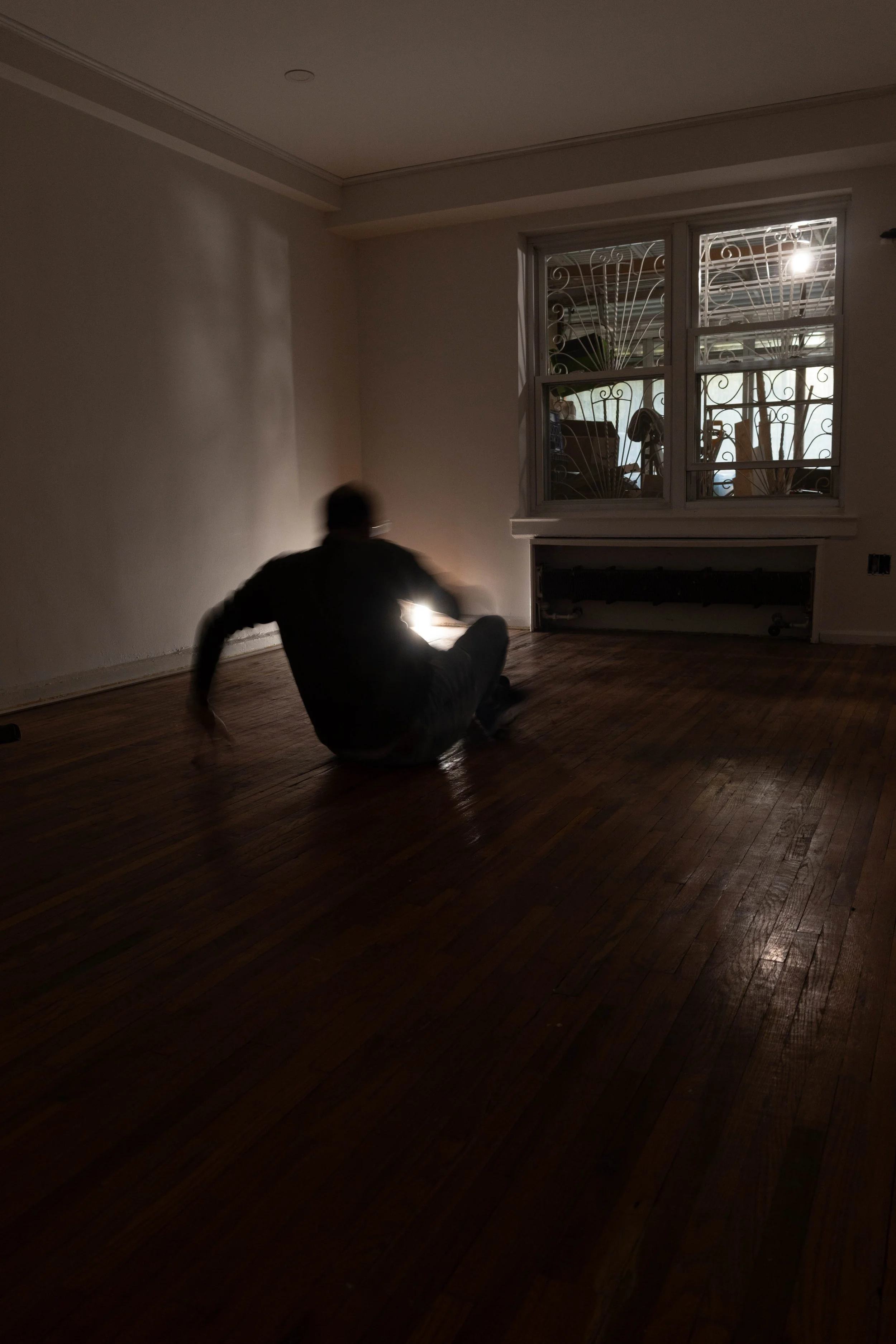
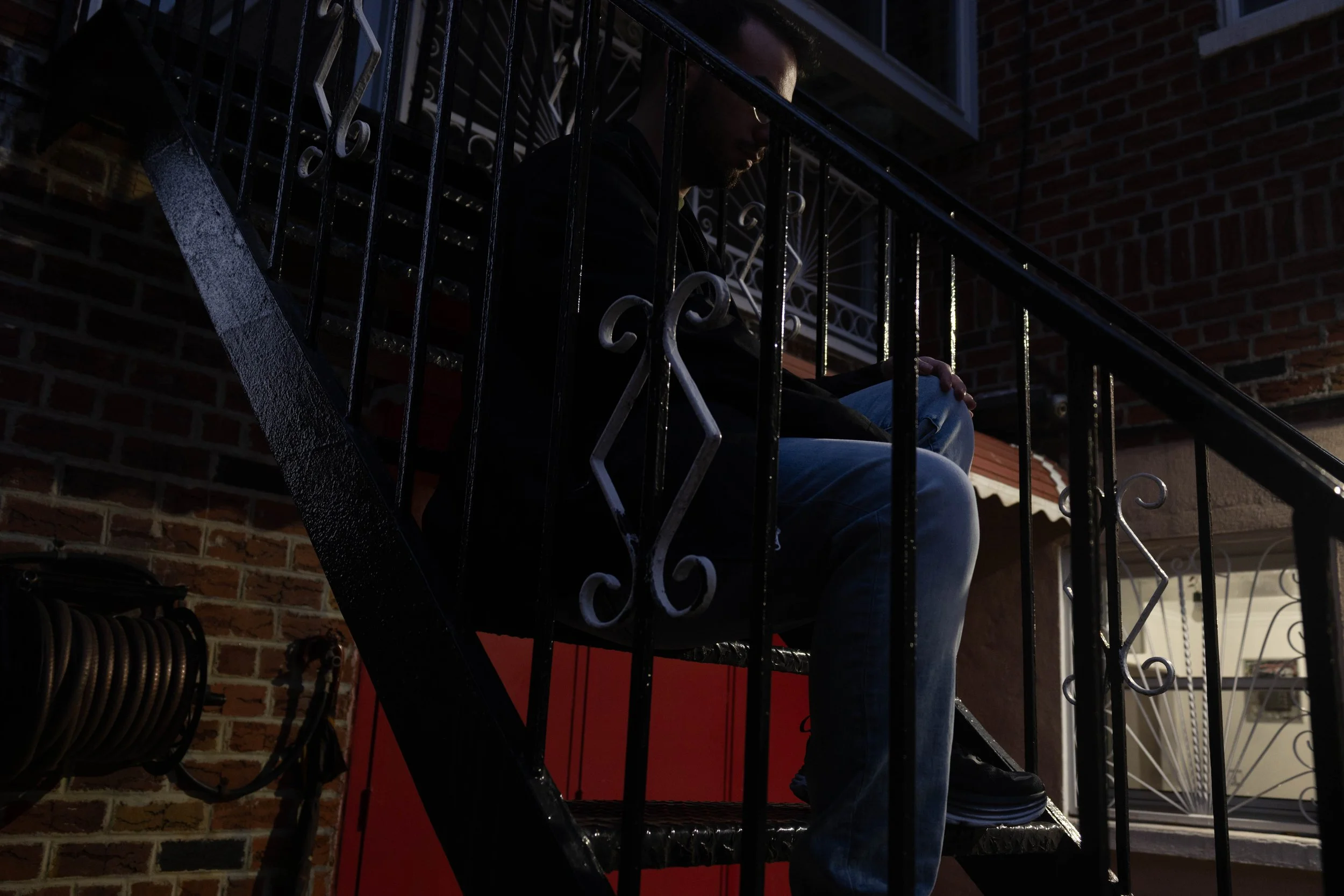
Year:2025-present
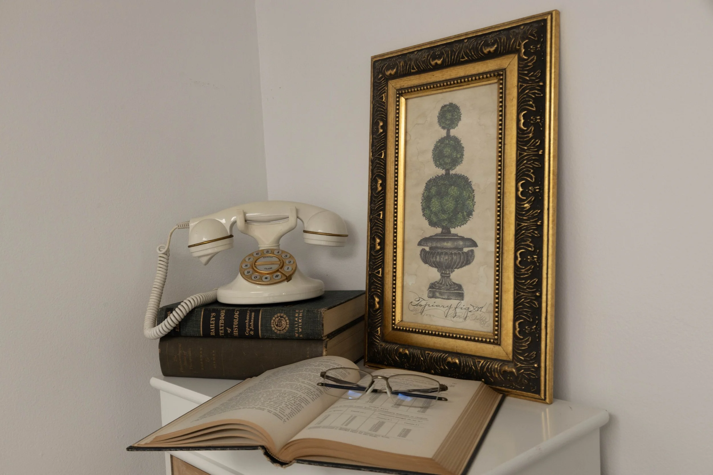
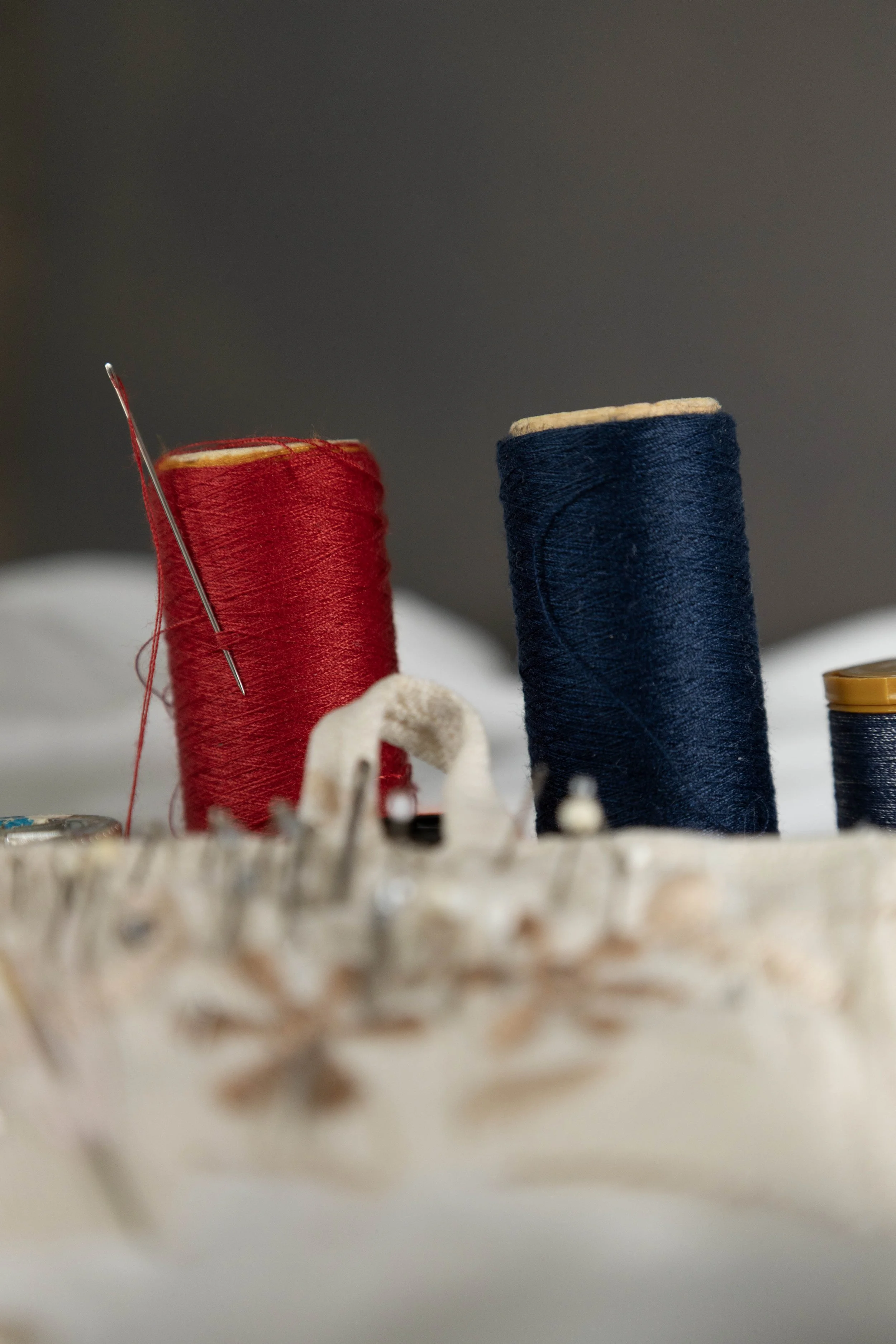
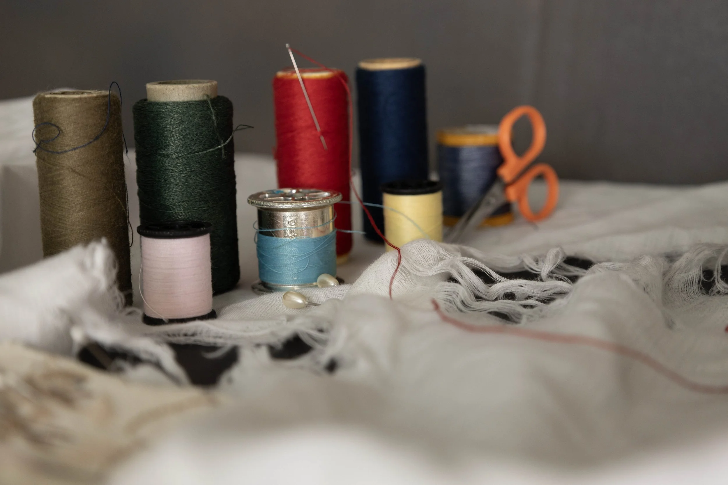
Role: Photography (what else)
I am new to photography but am eager to learn and adapt
Role: Animator and editor
Year:2027
For my Capstone project I wanted to animate a commercial relating the resent coca-cola and World Cup collab. I work at a supermarket and saw some products relating that that gave me the idea to do so. Started out with research on what other products they sell and finding a color tone to mach the mood I want to portray.
There were some hiccups along the way and would revisit to do such ups but i’m pretty happy with the results.